Covid press conference graphics send confusing message, experts say
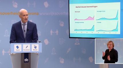
Prime Minister Mark Rutte and Health Minister Ernst Kuipers used graphics for the first time during a coronavirus press conference. The new presentation style was received well overall yet experts said there is still room for improvement in delivering the message.
"You help understand information better with pictures. The only thing is that those pictures have to be synchronized with the argument and that was not the case," Professor of Health Communication Julia van Weert told NOS. Van Weert criticized a graphic showing a rapid increase in coronavirus infections in four countries. "The graphic begged the question: Why is everything closed here if it is going well in comparison?" Van Weert said.
Experts also commented on the number of slides used. "Kuipers spoke in a calmed and informed manner, but he wanted to say too much in a short time and used too many graphics," communication expert Lars Duursma said.
Van Weert said that Kuipers was easier to follow than his predecssor Hugo de Jonge. "It could be more comprehensible. But Kuipers is much less verbose than De Jonge," Van Weert said.
De Jonge posted a picture on Twitter of himself watching the press conference at home with his feet up, popcorn and an alcohol-free beer.
Persconferentie kijken🍿 pic.twitter.com/psVz1EpBIy
— Hugo de Jonge (@hugodejonge) January 14, 2022
